
Creating A Responsive eLearning Course? Here’s What To Look Out For!
The concept of Responsive Web Design exploded in the web design and development domain several years ago and was coined by independent web designer, Ethan Marcotte in 2010 in the blog A List Apart. Marcotte said:
“RWD is an approach to web design aimed at crafting sites to provide an optimal viewing and interaction experience—easy reading and navigation with a minimum of resizing, panning, and scrolling—across a wide range of devices (from desktop computer monitors to mobile phones).”
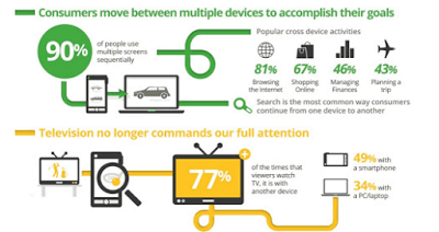
Within two years, a 2012 study by Google indicated a sharp uptick in multiscreen device usage: A whopping 98% people switched between “screen” devices daily (from PC to smartphone to tablet and so on) to perform/complete a particular task.
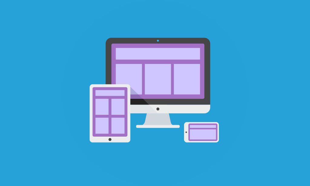
These sweeping changes significantly impacted the eLearning industry with regards to how users accessed eLearning courses. Given users’ propensity towards “sequential usage”, one of the foremost priorities of an eLearning developer would be to customize user experience and simultaneously ensure that in spite of device-focused customization, experience across devices required little to no viewing adjustment by user.
What To Look Out For When Creating A Responsive eLearning Course
Here are some key pointers to be mindful of while creating a responsive eLearning course:
1. Identify Breakpoints.
Breakpoints are understood as “predefined dimensions of a device or browser window, typically expressed as height and width in pixels”. Typically, for each dimension set, breakpoints indicate the ideal layout for features and content and allow you to customize across devices.
Although one can create eLearning courses for a multitude of breakpoints, it’s recommended to conduct a survey to zero in on most popularly used ones: For a mobile landscape display the most commonly used is 480 pixels; 1024 pixels is considered standard for tablets, and 1280 pixels is par for the course for laptops and personal computers.
Additionally, conducting a poll at the pre-development stage will help you learn about users’ accessibility options and other technological preferences, inputs that a key role in the course’s future development.
2. Explore Different Versions.
When trying to identify optimum content layout, given device-specific limitations, one can omit or resize graphics and fonts used to attain a cleaner user interface. For example, while designing any site, depending on device size, certain content may be ‘hidden’ from the user until a specific user action such as tapping, roll-over etc. is detected.
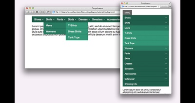
Additionally, while designing a course, navigation options can be customized according to device: Opting for a drop down collapsible menu on a smartphone vis-a-vis a traditional menu on a laptop/PC is a fairly common strategy. Other design elements such as images can also be ‘concealed’ to optimize user experience on smaller devices: However it’s imperative to note that, ideally, these elements would continue to be accessible to all users although in a collapsible format.
3. Stick To Bare Essentials.
Ideally, one makes the assumption that identical content across devices would ensure consistency. However, in the interest of a comprehensive yet uncluttered interface, one may edit content. For example, on popular eLearning site Coursera the weekly content index is preceded by a lengthy note from the instructor on what the module accomplishes. However, while viewing the same page on Coursera’s mobile site, instructor’s note is amiss. Most likely, given paucity of screen size, the note wasn’t retained to avoid overcrowding of content.
Hence, it’s key to determine and include bare essentials in the course whether it be text, graphics, images, and consider keeping out the rest.
Are There Tools To Facilitate Creating A Responsive eLearning Course?
To create a responsive design eLearning course that is multiple device friendly, there are several well known products like Adobe Captivate 9, Adapt Learning, and Gomo. These dedicated eLearning authoring tools allow you to create courses and corporate training content based on a master layout that is adaptable and accessible across all devices.
These tools allow you to add video, dialogue simulation, text content, graphics while creating courses, and also allow a massive amount of customization with respect to every aspect including layout, images, themes, templates, etc. They also have features that allow the course creator to use variable display conditions to determine what a particular slide would look like to an eLearner across respective devices.
It’s important to point out here that despite dedicated authoring tools for responsive eLearning, creating such a course can be significantly more time consuming as every page is required to be thoroughly tested across layouts, browsers and devices especially if there is device specific customization.
During the creation phase of eLearning courses, these can be periodically reviewed with help of Chrome Developer Tools. These tools are in built into Google Chrome and have a feature called ‘Device mode’ that allows you to test responsiveness of the site/course under development against varied device sizes via its ‘screen emulator’.
Additionally, there are tools like ZipBoard which allow you to test course content, layout, and placement of elements across screen sizes. There are some standout features here: Content/layout can be tested across different screen resolutions from within your browser. Without switching between device/screens eLearning course designers and developers can clearly envisage the look and feel of the course across different devices.
Separately, given that minutely testing a responsive eLearning course would be a massive exercise in collaboration between eLearning developers, Instructional Designers, and others stakeholders in the eLearning course can use tools to visually share their feedback with ease via annotations on screenshots taken at different resolutions: This feature could be used to identify bugs and adjustments required in a particular slide at every stage of the course’s development.
It’s important to point out that the test/review feedback need not be limited to course collaborators: In the early stages course development, early users can also be roped in to assist with providing accurate and precise feedback.
There exist several other tools which provide for testing and review of eLearning courses to help identify issues of functionality, accuracy to help create a product which is in sync with the prospective user and his chosen mode of device.
Final Word
Creating a responsive eLearning course which must appear consistent and seamless, regardless of device it’s accessed from, entails consistent review and testing and above mentioned tools offer great value.
However, do keep in mind that tools mentioned above are essential for preliminary testing, as they can provide a close approximation of how your eLearning course or website would look on a mobile or tablet, but they are not intended to be a substitute for testing performance characteristics across real devices.