
It’s Time To Switch To Responsive eLearning
There are many benefits to responsive eLearning. Not only that, but with the rise of BYOD (bring your own device) and an increasingly mobile workforce, responsive content is quickly moving from a “nice to have” to a “need to have.” Overwhelmed by the idea of converting all your existing content, or starting from scratch on new responsive eLearning? Here are a few reasons you’ll be glad you switched:
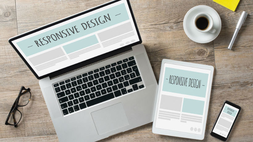
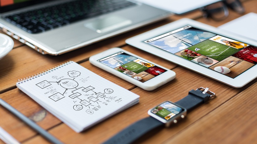
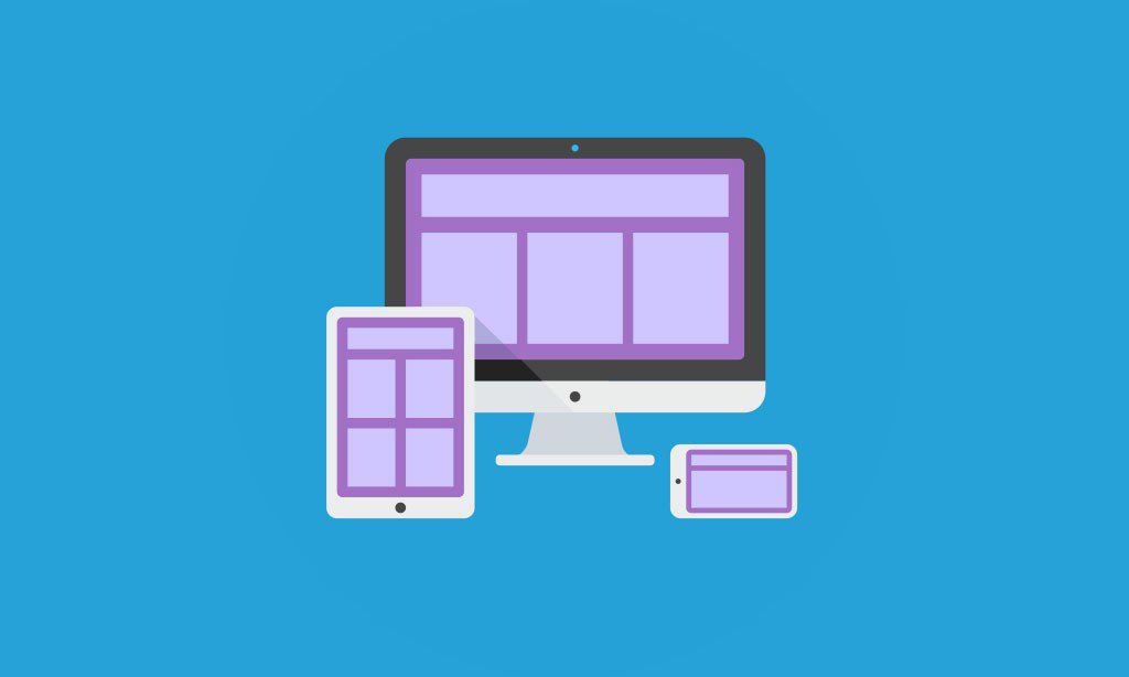
1. Create once, access anywhere
You could sit down, make a list of all the devices you think your learners might use to access training content, and then design a new version of your course for each device. Or you could design one responsive course that will adapt to whatever device screen size it’s displayed on. I don’t know about you, but I pick option 2.
Up until recently, eLearning authoring tools hadn’t quite caught up to responsive web design methods. But now, you can easily create responsive eLearning right within some of your favorite authoring tools, like Lectora®.
Responsive Course Design™ (RCD) in Lectora is unique because you only have to design once, in the desktop layout. Content in the desktop view is automatically positioned and sized for landscape and portrait views on tablets and phones. Using Lectora’s RCD is also more efficient and cost-effective than other responsive eLearning development options.
2. Second screen learning
Perhaps your learners want to be able to take a course on their desktop computers while in the office, then later reference that content on their phones while out in the field. Creating responsive eLearning ensures that they’ll still be able to access that course on the go without losing important information.
3. Future proof
The great thing about the way Lectora does responsive eLearning is that it does NOT use width-based breakpoints. John Blackmon, Trivantis CTO, says, “If you use a width-based breakpoint to define content for a tablet, what happens when the newest phone has a logical screen width that is the same as the tablet? The view you intended for a tablet is used on a phone, even if the screen on that phone is too small to render it properly. As technology progresses, this problem will occur more often.”
With Lectora’s RCD feature, you design for device type and orientation, instead of screen width, ensuring that your content will display well on all devices, even ones that haven’t been released yet.