
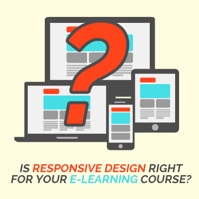
When to use responsive design in e-Learning
Research shows that on average we spend 4.4 hours of our leisure time in front of screens each day. Time online is spread between smartphone, tablet, PC/laptop and television.
The device we choose to use at a particular time is driven by the amount of time available, the desired goal, where we are and what our state of mind is. In other words, context drives device usage. So, when designing e-Learning, consider the context it will be used in before you decide if you need to allocate resources to responsive design or if the majority of your learners will prefer to just take the course at their desk or on a laptop.
Remember, using responsive design for learning development is often more complex, resulting in higher costs and more time. Therefore, you want to make sure it’s necessary before you go down the responsive learning rabbit hole!
Of course, many people expect to be able to take their learning with them. New technology like CourseMill®Mobile allows employers to deliver training straight to their employees’ phones. The employees can then work on it anywhere—whether they’re connected to the internet or not—and their activity is sent back to the company’s learning management system. Make sure you ask if the e-Learning content you’re working on will be delivered via a mobile learning solution. In that case, you’ll definitely want to use responsive design.
Performance support and just-in-time learning are two learning types that are frequently delivered via mobile devices, so these are good candidates for responsive learning design. And since these are usually shorter pieces of content, they can be a good trial run if you’re just starting to develop responsive learning. Another option would be to create a mobile resource guide that accompanies a longer, content-heavy piece of desktop e-Learning. For example, you could include some videos that demonstrate the principles covered in the course, or highlight quick tips from each module. This is a great way to make the most out of the graphics and content you already created for the desktop e-Learning course and then repurpose them as a responsively designed mobile reference.
Make sure to use an authoring tool that publishes to HTML, like Lectora® Online. This will help as you are creating mobile-friendly e-Learning.
Just remember, it’s all about the learner. If the learner and the context he or she is taking your course in don’t demand responsive design, give yourself a break!
For more information on creating m-Learning with Lectora, subscribe to the Lectora e-Learning Blog or download a free trial.