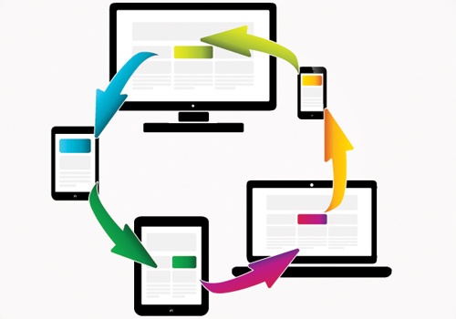

With eLearning activities, we’ve had it easy when it comes to audience identification. We know where our users will be and how they will be using our training—they are on a laptop/desktop; have a good network connection and power supply; and have keyboard and mouse input devices.
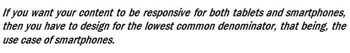
Mobile and in particular BYOD is challenging this and forcing us to refocus on standards and use cases for our users. This is important as the concept of eLearning Responsive Design has received a lot of buzz and may lead some eLearning designers to view it as a total solution and as a way to bypass this step. Unfortunately, this is not the case—today, when confronting a project, you need to consider your audience use case.
This use case should help you define the learning experience as well as determine whether eLearning responsive design will help or hinder your solution.
Our Devices Define Our Use
Looking at the data on how people use their mobile devices can provide some guidance on this. As you look at this data you should note distinct differences between tablet and smartphone users:
|
Tablet users |
Smartphone |
|
|
Presence |
Users often carry these around and they are seen as a shared device. |
Users see these as an extension of themselves—they predominately have these devices on or near their person. |
|
Use |
Predominately users sit or recline when using these devices. In |
Predominately users are standing or walking. Most users hold these devices in their hand(s). |
|
Network |
Predominately users have strong Wifi connections. Rarely do they use cell networks. |
Users cycle between Wifi access and cell networks (users |
|
Input |
Users often have external keyboards for extensive text input. In addition, users have both hands free for complex touch interactions. |
Predominately one thumb is used as the main input device—occasionally users will cradle their devices for moderate input needs. |
|
Device |
Users typically use these devices in a |
|
|
Activities |
The most common activities on these devices include watching videos, reading and gaming. Typical time usage is longer in duration (10-15 minutes). |
The most common activities on these devices include social media; email and other utilities; and searching for information. Typical time usage is short in duration (5 minutes or less). |
Given these characteristics, the use case for tablets is more similar to laptops/desktops than it is to smartphones. With tablets, people are using them for longer periods of time, have consistent data streams and can perform complex interactions on them. As such, your eLearning design options and strategies for tablets should be similar to normal eLearning.
This isn’t the case with smartphones as people don’t use them for extended periods of time, have the ability for complex input or have consistent high bandwidth access. This means that your eLearning design options for smartphones are rather limited in comparison.
As to what all of this means for eLearning responsive design, it’s rather simple:
When you ignore this rule, you run the risk of creating an unpleasant experience for one of your groups— smartphone users will not enjoy a solution built around the tablet use case. Such an experience may mean that your content loses credibility and causes people to avoid it.
As an eLearning designer, having such a rule in place represents a challenge. In this regard, your upfront analysis may indicate a strong need for a more traditional eLearning course design; you may document requirements for high bandwidth use; or your solution may require complex interactions. Having to dumb down the content to meet a smartphone use case may interfere with this solution. In this case, using an eLearning responsive design would be setting your content up for failure as it wouldn’t meet your true needs.
eLearning Strategies That Support a Smartphone Use Case
Fortunately there are several eLearning strategies that fit within the smartphone use case. Employing these eLearning strategies may create a situation where eLearning responsive design makes sense or doesn’t hamper the user experience.
Microlearning
This represents a group of strategies that are aimed at minimizing the steps involved in the learning process. Traditional Tell/Show/Do and Nine Events of Instruction models have been pared down or replaced. In these strategies, objectlets instead of courses are used and chunks of practice, repetition,… are pushed/pulled to users. Forms of this include:
- Continuous learning highlights how quickly and how much knowledge is lost after our training activities. This forgetting curve can be delayed or side-stepped by providing practice and repetition. Access to quizzes, flash cards, short videos, related articles, … can provide this practice and repetition.
- Social learning highlights the need our users have for interaction and feedback to experts and peers. These strategies provide mentoring and coaching opportunities that helps our users internalize information and guide them on where to go next. Social collaboration on wikis, communities of practice and content aggregators allow for these activities.
Performance Support
This represents a group of strategies that are aimed at bypassing the learning function. In it, tools and mechanisms are designed to help users complete their duties without having to internalize content. These tools often show up in the form of job aids, handouts and help files but can take other forms like GPS navigation systems.
- Just-in-time (JIT) learning is a powerful strategy that is used to create avenues to access, use and internalize information at the time of need. These environments address Gottfredson’s 5 moments of learning need and can be quite powerful. Materials may consist of job-aids, manuals and quick reference materials.
- Metacognitive support is a strategy aimed at helping our users plan, evaluate and manage their active tasks. These tools communicate information to our users on how they are doing, what they need to focus on and what they may need to know/do next. The use of augmented reality and reminders/alerts can give our users valuable real-time input into their learning needs.
As you consider a performance tool you should be careful when examining your use case needs. If your users need to input a lot of data, then a smartphone use case may not be appropriate for that tool. Technologies like text-to-speech or allowing attachments to user created videos/audio/images can lessen some of these concerns.
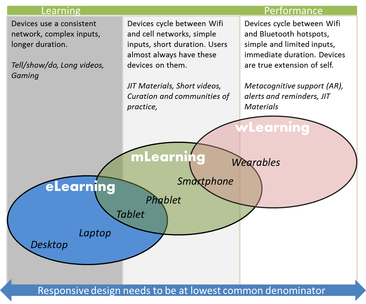
Our Devices Are Moving Towards Performance
Use case concerns are relevant when looking at our next type of mobile device. Wearable devices like Google Glass, Smartwatches and other technologies offer new opportunities to drive and support learning.
As to their use case, this is unclear at the moment as these devices take many forms and are rapidly evolving. Common to them though is a constant presence, limited and simple inputs; and unique user interfaces.
This constant presence is important as it magnifies the extension of self that is associated with smartphones. It also extends abilities with augmented reality, JIT and the alert features with these devices. As such, wearable devices make an attractive tool for performance interventions. They also confound your responsive design concerns by swinging the use case around.
In this regard, if your solution is focused around alerts, reminders or augmented reality, then making your design responsive to tablets doesn’t make sense as user rarely have them readily available. The least common denominator would remain the smartphone as their use case is more similar to wearables.
Your eLearning Solution Should Drive Your Device
As an eLearning designer, making your eLearning content responsive across devices shouldn’t be a main concern; rather creating optimal learning or performance experiences should be your focus. In this regard, remember that tablets and laptops have similar use cases; while smartphones and wearables share a similar use case. With your solution pick a use case as your standard and stick to it. Mixing these use cases isn’t going to create a responsive design rather it’s going to create a bad design.