

How To Create Responsive Courses With Adobe Captivate 8
You can author as you always have—content will rearrange itself for the new tablet and mobile views. You can also tweak and/or design content for specific devices and use the in-product preview to see how your course will appear on various screens. And finally publish as a single project to automatically deliver the most appropriate experience for your learner’s device.
To make the most of responsive feature in Adobe Captivate 8, here’s a list of best practices you can follow:
Tip 1: First things first – Set breakpoints:
Adobe Captivate 8 has three default breakpoints/layouts based on the most common device viewport sizes. Viewport size is the visible area, excluding the area covered by the address bar and other menu options, in the device browser.
Do your own small research on the viewport sizes of the devices your learners use; and modify the breakpoints accordingly. You can find out the device viewport dimension by accessing this site on the device browser: http://viewportsizes.com/mine/
Tip 2: Planning to include playbar? Read on…
If you are planning to include a playbar in your course, make sure you deduct the pixels from viewport height that will be occupied by the playbar. Hint: The default mobile playbar in responsive projects is of 45 pixels height. So if the viewport size for the mobile device is 360 x 576, set the course dimension as 360 x 522 after deducting 45 pixels from the height. Do the same for other two breakpoints to fit content well on the devices.
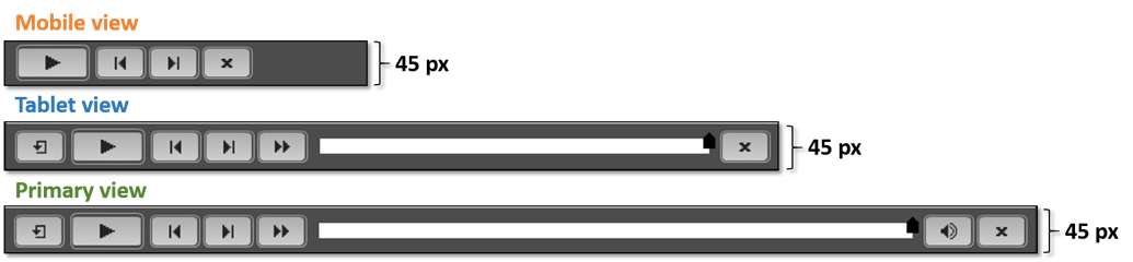
Bonus tip: You can also customize the buttons appearing in Primary, Tablet, and Mobile views by modifying the playbarScript.js file. Here’s a detailed step list to make the changes.
Tip 3: Maintaining aspect ratio:
Maintaining aspect ratio is really important with responsive content as it can go haywire if the objects start scaling based on the screen dimension. To maintain aspect ratio of the objects, select Auto for either width or height of the object in the Primary view. Notice in this example, how the illustration on the left becomes distorted and the one on the right maintains the aspect ratio.
Tip 4: Resolving the text truncation issues:
Adobe Captivate 8 does a good job of adjusting the text font size to fit the text in the text captions in Primary, Tablet, and Mobile views, along with in-between views. But, if you are still facing text truncation issues, use Auto or %Relative size options for text caption height and the caption will auto grow to accommodate all the text in the caption. Notice in this example, how the text in top two captions are truncated in-between views and the bottom two text captions auto grow to accommodate the text.
Tip 5: Moving the objects together:
By default, the position of an object is linked to the edges of the slide. To change it to follow another object on the slide, select Smart Position and drag the object handles to attach them to the desired object. This functionality is highly useful for screens with flowcharts where you want the objects to move based on the position of the main object(s) in the flowchart or character image with speech bubble. Notice in this example, how the right speech bubble moves along with the character image and the left speech bubble is out of sync.
Tip 6: Linking the overlay objects:
If you are using overlay objects, and want them to be positioned on the slide together, use % Relative for the vertical properties (height/top/bottom) of the object in Primary view, which will move the object based on the slide width instead of the object width. Some of the examples of overlay objects are: highlight box on top of an image, arrow pointing to the clickable area, video/animation on top of a placeholder image, etc. Notice in the example, how the highlight box remains intact on top of the right image, and goes out of sync with the left image.
Tip 7: Exclude objects with caution:
Adobe Captivate 8 allows you to design different elements for Primary, Tablet, and Mobile views. You can create and add view-specific objects and remove them from other views. To remove an object from a particular view, simply move it from the stage to the scrap area. To keep the object in just one view and exclude from the rest of the views, right-click the object and select Exclude from Other Views.
Here are some words of caution when excluding objects from different views:
- Don’t delete an object from any of the views, it will remove the object from all the views. Just move it to the scrap area.
- Don’t exclude an interactive objects from any of the views. The interactive objects have a Pause action attached to them and will result in pausing the project with no button on the course interface, to click and move ahead.
- Also, don’t exclude objects with audio/video attached to them. You might hear audio, even though the object is not visible on the stage.
Looking for more resources on creating Responsive eLearning with Adobe Captivate 8? Here you go…
- Example course: Adobe Captivate 8 & Mobile Learning
- Article: Responsive eLearning with Adobe Captivate 8: Step-by-step
- Blog post: Adobe Captivate 8 Reimagines Responsive eLearning for a Multi-device World
- Recorded Webinar: Create stunning mobile learning courses with Adobe Captivate 8
- Recorded Webinar: Do's & Don’ts of Creating a Responsive Courses with Adobe Captivate 8
- Video Tutorials Playlist: Responsive eLearning with Adobe Captivate 8