
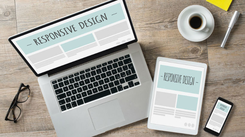
How To Create A Multi-Platform-Friendly Responsive eLearning Course: 5 Tips
However imaginative your content is, it will only really shine if it’s easy on the eye. You know what you want your learners to get out of your courses, and the surest way of achieving your goals is with beautiful design which makes a great first impression and keeps learners engaged and interested. Design is vital and exciting: Embellish your learning with easy navigation, smooth interactive elements, responsive and adaptive capabilities for any device and well thought-out text and pictures. You’ll be rewarded with an enthused group of learners who look forward to continuously enhancing their skills and knowledge.
Get a free eBook on how to create and distribute a Responsive eLearning Course
1. Use Appropriate Image Sizes – In Both Senses Of The Word
Make sure your images are web-friendly in terms of the physical size on the disk of the computer. At gomo, we see hundreds of free trial sign-ups and people sometimes complain that the course is ‘slow’. This is usually down to uploading huge unedited images which are then slow to load in a course. Modern, high-megapixel cameras routinely create images in excess of 10MB. These will be slow to load, especially on a smartphone, and there’s usually no need for that level of detail. A full-screen image or background image should be around 1MB at most, unless it’s zoomable and you’re asking the user to study the detail. An image that’s just for illustration on half a screen can easily be as small as 100KB without causing problems or negatively affecting the look of the course.
There are lots of cheap or free tools to compress images. Paint, which comes standard with Windows operating systems, is a good example, as are many photo editors which often have a ‘web publish’ compression option. Bear in mind that learners use different devices to complete courses on. Your images should therefore be the appropriate size in width and height for their intended use. A huge world map might look great on a desktop or tablet display but very hard to view on a smartphone in portrait mode. For the mobile user, it’s worth replacing the landscape world map with something that scrolls vertically.
2. Employ Device Targeting
The best authoring tools will allow you to target devices with specific content. The world map is a good example. If your course is going to be consumed on a smartphone, think about the user experience on the phone and serve up the appropriate content. A verbose paragraph of text on a desktop might work better as bullet points on a mobile. A 10-minute video on desktop might be better with the 1-minute version on smartphone. In an IT training scenario, a clickable simulation might be best on desktop and tablet, but a video is better on a smartphone. If your authoring tool features adaptive capabilities, that’s even better, as it will adjust common interactions for you automatically so that they play back in the device-appropriate way.
3. Use Fluid Navigation
Modern learners are looking for more from their eLearning than ‘click next to continue’. Smartphone users are used to swiping – it’s the natural way to consume content on websites and apps so why not with eLearning too? The best authoring tools will allow you to create the user journey you’re looking to deliver, with vertical and horizontal scrolling built in. The right tool will even allow ‘continuous’ scroll where learners can scroll almost infinitely through a series of pages.
4. Videos Should Be No More Than 4 Minutes Long
This is the hardest one to stick to but learners inevitably look at the seek bar first and their heart sinks when they realize that they’ve got so sit through 20 minutes of video. Research has shown that 4 minutes is the longest a learner will be able to pay attention to a video for. After this, attention spans tend to drift.
5. Use A Truly Responsive Authoring Tool
Of course, if you have a truly responsive authoring tool, a lot of the above features will be built in, allowing you to get on with the business of creating your content.
If you want to know more about responsive design, download the free eBook Fluid & Future-Proof: How To Create And Distribute A Responsive eLearning Course.