
Creating A Responsive eLearning Course: Why Responsive Design Is The Future Of eLearning
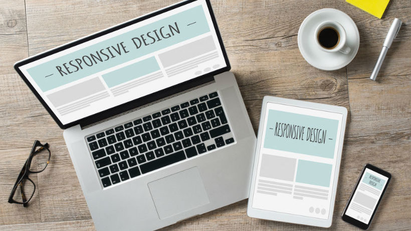
From smartphones to desktop computers, seamlessly optimized design is something you should be able to count on as a standard strength when presenting a course, with the right authoring tool enabling you to achieve impressive results. Instead of compressing slides or leaving blank space around pages, which is a particular hazard on pages designed several years ago, courses can now be designed dynamically to fill all the space, whatever the size of the screen, in the best possible format – laid out in a variable number of columns, for instance, so that images and text interact perfectly on a page where touchable buttons make it simple for learners to smoothly navigate their way around each page.
Get a free eBook on how to create and distribute a Responsive eLearning Course
What Is Responsive Design?
Responsive design is a term coined in 2010 by developer and author Ethan Marcotte, which essentially makes content flexible and easy for everyone to use. With responsive design, you don’t need to worry about the course you have designed losing its effectiveness on certain screens, or failing to meet the expectations of learners who expect it to be as easy to use on a desktop computer as they do on a smartphone.
Analytics and reporting tools invariably show that people visit websites via dozens of different operating systems, browsers, and screen sizes. As technology advances and broadens, this trend is certain to continue, making each learner’s experience vastly different.
Why Is Responsive Design The Future Of Online Learning?
1. Responsive Design Adjusts To Fit Any Screen
Courses without responsive design sometimes push sections of content into the top third of a smartphone screen, for example making quiz answers awkwardly small for the reader to select and the text too tiny to read easily. They may also fail to take advantage of the improved screen resolution available on many devices. With responsive design, you can adjust the precise width and number of columns in order to display the components of your pages however you choose, or you can use a comprehensive set of ready-made backdrops and layouts offered by the responsive authoring tool, flowing your content into a ready-made layout.
Placing different blocks on the screen and adding your content to them shouldn’t require in-depth technical skills, and you can designate text, images, video, or interactions to each part of the page, with each section adjusting to accommodate the length and size of the content in any language. By using CSS media queries –a way of meeting the specific requirements of the page without changing the content of the learning –responsive design adjusts to fit the screen, optimizing the size of your eLearning course without reducing the speed with which the page loads.
2. HTML5 Allows Your Learners To Enjoy The Course On Any Device
The backbone of responsive design is HTML5, which is responsible for the way in which most internet pages run. HTML5, which enables all the elements of a page to run together without extra plugins, can help you to tailor the design of your content to galvanize the possibilities offered by multi-device functionality. Any good responsive authoring tool should support the HTML5 coding, but –and here’s the good news for anyone who’s not too technical– you don’t actually need to work with the complicated code, because the authoring tool should take care of the ‘heavy lifting’ for you.
This good news means that your learners can enjoy the course on whichever devices suit them, and you won’t face the hassle, time and development costs of building numerous versions of the same course. There should be no need for creating five versions for the same course, for example, to match the requirements of the device being used or the orientation your content is being viewed in.
3. You Can Customize Your Courses Whenever You Want
Layouts are a great way to get started and keep the look of your courses consistent, but they should be free-form and they should not limit your ability to add as much content as you like and implement elements such as zoomable graphics, carousels, and third-party content from places like YouTube or Google Maps.
Anything that runs on the internet should be able to run in the layout, as long as the element itself is responsive. You should also be able to choose from updated themes and customize them regularly, allowing you to refresh your design or company branding whenever the necessity arises.
4. More And More Organizations Go Responsive
The BBC is one of the organizations to place particular importance on responsive design. The BBC Academy provides hundreds of different training courses to BBC staff, which means that its published content needs to automatically resize to fit the screen sizes and operating systems of its many different learners. This wide-ranging need for flexibility and style made gomo an attractive proposition for the designers of the Academy’s courses.
Another benefit is being able to look at a simple preview of how the content would look on different screen sizes, a key aspect of responsive design which allows designers to know exactly how their course will display before sending it live and giving access to learners.
Within any preview portal, you should be able to switch between how your pages will look on different devices and appear in both landscape and portrait mode, for example. This allows learning designers and Learning and Development teams to gain invaluable feedback. For example, once your colleagues have told you about the design elements of your course which they may have found effective or tricky to navigate, you can use your authoring tool to quickly amend the responsive design by making some straightforward edits.
Another feature of gomo’s responsive design, continuous scrolling, was also important to the BBC, allowing content to be displayed vertically and to therefore load more content as learners move down each page with a mouse or touch screen.
Alternatively, courses using responsive design can run in a horizontal slide format, with click-to-continue navigation. A responsive tool should give you the opportunity to pick the navigation that best serves your learners, or offer a combination of both.
Final Word: Planning For The Future
Importantly, an authoring tool with responsive design gives you peace of mind that your learning will still be optimized on the wide range of as-yet-unreleased devices learners will use in the future. Responsive design ensures that, no matter how your learners view your content, they will always find it easy to read.
If you want to know more about responsive eLearning courses, download the free eBook Fluid & Future-Proof: How To Create And Distribute A Responsive eLearning Course.
Related Articles:
- Free eBook – Fluid & Future-Proof: How To Create And Distribute A Responsive eLearning Course
- 3 Major Advantages Of Creating A Responsive eLearning Course
- 5 Tell-Tale Signs That Your Learners Are Ready For A Responsive eLearning Course
- 5 Features Of A Responsive Design eLearning Authoring Tool