
What You Need To Know About The Cone Of Experience
Gather 'round kiddos, Uncle Lubos from Obsidian Learning wants to tell another crazy but true story. This one is about an innocent kid (i.e., How did young Lubos first experience the Cone?), an abused model (What did adult Lubos learn about the Cone?,) and—if you stick around till the end—a wholesome apple (What did the Cone really want to give teachers?).
Boy Meets Cone
Our story begins back in my college days, back before phones had Google and books came with free Prime shipping. One of the books I'll never forget wasn't a book per se, but a bulky three-ring binder of recommended reading for future leaders. Distributed to members of a student organization I was in, this "book of insight" devoted a section to how people learn.
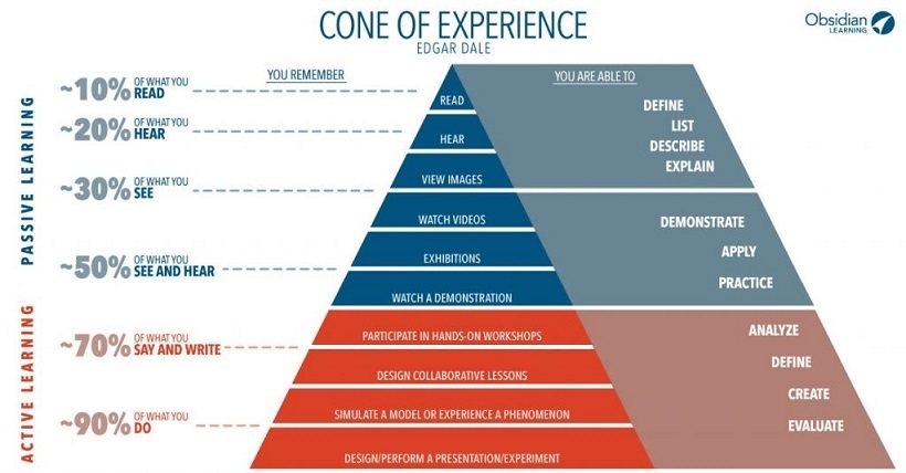
As a business student with no prior exposure to cognitive psychology, I found the thinking and learning section utterly fascinating. A particular object of fascination—one that offered immediate value to me as a learner—was a training and development tool called the cone of learning. The version in my book looked similar to this:
Figure 1. Cone of Learning example from Wikipedia (Jeffrey Anderson)
The cone claimed we remember more from doing than from reading—not exactly a shocker. What intrigued me was the link between how much we retain and which senses we involve—a concept I could use when I studied for exams. Why "read" course material if I'm only going to remember 10%? Aha, but if I "say and write"...hello 70%?
Granted, the numbers seemed a little unrealistic, but my instincts told me to trust the cone. Targeting results down at its base (90% remembering!), I upped the intensity of my pre-finals studying, by delivering dorm-room presentations to audiences of zero. If the subject matter demanded more strenuous memorization, I'd rewrite and recite information I needed to retain.
And it paid off! Semester after semester these cone-inspired routines powered me through to mostly As and Bs.
After graduation, the cone and I went our separate ways. While I jetted off to my first corporate job, it made its rounds training the trainers. We didn't cross paths again until many years later—when a casual search for "cone of learning" revealed a betrayal of trust I could never un-Google.
Getting Con'ed
The cone was a con! As in fraud! ...phony! ...fly-by-night peddler of snake-oil solutions!
It pitched an oversimplified cure-all for optimizing learning activities. It passed off fallacious folk wisdom as legitimate research findings. It impersonated the work of an educational media pioneer. And in my case, it misled me to believe that performing to dorm furniture was immensely superior to sitting and reading on it!
Woulda coulda shoulda background-checked the cone? Here's what I might've discovered, had I not gone to college roughly a decade too soon. (The articles cited below were yet to be published when I was in school.)
Fact #1. The retention data—i.e., percentages of what people remember—date back to "folkloric maxims" from the early 1900s or before (Subramony, Molenda, Betrus, & Thalheimer, 2014a, p. 8, 12).
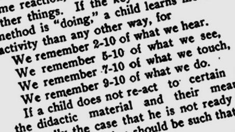
Figure 2. Photocopied page from the December 18, 1913 issue of the Journal of Education. Source: Retention Data Timeline
Subramony et al. (2014d) and Betrus (2016) document more than two dozen appearances of such percentages (without the cone) in publications over the past century. Among the first nine instances, none of the people who quote retention data provides a source, but some use lead-in phrasing that plainly shows grounding in good ol' conventional wisdom (bolding mine):
- 1915, academic journal: "...for it is said we remember 10% of what we hear, 15% of what we read and 20% of what we see." (Betrus, 2016)
- 1920, newspaper: "It is an old maxim in education that we remember 5% of what we hear and 50% of what we see." (Subramony et al., 2014d, p. 32)
Fact #2. The retention data—i.e., their specific percentage values and categories—have fluctuated repeatedly since 1913, and virtually always in increments of 5 and 10.
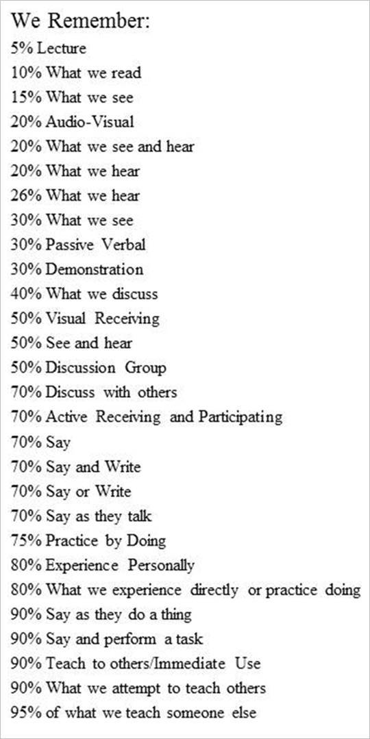
Figure 3. Compilation of retention data variations, from a slide presented at the 2002 AECT conference. (Januszewski & Betrus, 2002)
Like Grandpappy's words of wisdom, or garbled messages in a game of telephone, the remembering percentages have been relayed in umpteen variations. And we're not just talking minor, expectable differences:
- Retention figures associated with "seeing" include 50% (1913), 20% (1918), 85% (1922), 30% (1962), and 15% (2002).
- 90% retention has been attributed to "doing" (1913), "saying and doing" (1962), "simulated experiences" (1979), and "teaching others" (2001). (Betrus, 2016)
Sure, different levels of retention for different types of activities could reflect findings on different groups of learners tested by different teams of researchers. And of course, these different research teams testing different learner groups could consistently find that different activity types result in different retention levels, which almost always round into neat multiples of 10?
Come on... really? The likelihood that this occurred takes just five words to refute: "Human variability precludes round numbers" (Thalheimer, 2015a).
Fact #3. The retention data are unsupported by empirical evidence and raise issues as to the supposed research behind them.
No body of research—scientific or otherwise—supports any variation of the remembering percentages (Thalheimer, 2015a).
No surprise, considering the implausibly precise rounding. And when we consider all the variables that influence learning and memory, it's no wonder that scholars challenge whether legitimate research could support the data in terms of scientific validity or logical interpretability (Subramony et al., 2014a, p. 15).
- Dwyer (1978) is one of the first to discuss how the data are "impossible to interpret or verify" unless we know how they were derived. He points out that even roughly rounded figures would only be pertinent to some specific content, audience, learning task and measurement method (p. 10, cited in Molenda, 2003, 2004).
- Lalley and Miller (2007) express skepticism toward the implied assumption that the activities tied to the purported percentages were compared "in a systematic manner employing sound research methodologies" (p. 69). They comment that to conduct research in which—at a minimum—the content to be learned, duration of instruction, delay between instruction and test, and instructor background were equivalent for all treatment groups would be a "daunting task indeed" (70).
- Subramony et al. (2014a) note that different types of learning, such as "reading" vs. "hearing," represent distinct learning goals that cannot be reasonably tested by the same instrument. That is, it wouldn't make sense to test learners who "read" a series of vocabulary words and learners who "hear" them on an audio recording in the same manner. The former dictates a written test, the latter an oral test. The two different measurement situations would not yield percentage results that researchers could compare—"it would be apples to oranges" (p. 8).
Fact #4. The retention data have been frequently misattributed since at least the 1960s.
Having established that the retention figures (1) existed in folklore, (2) exhibit unreliability, and (3) and exclude evidence of valid methodology, it seems borderline cruel to further discredit them. Then again, doesn't falsely crediting them constitute borderline fraud?
Over the decades, the retention data have racked up quite a list of questionable references, including those who insist the documentation was "misplaced" and others who cite people who never wrote about the percentages. These are a few examples of the latter, plus another whose status sounds a little Loch Nessie:
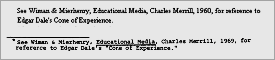
Figure 4. Erroneous references to Wiman & Mierhenry. Source: Corrupted Cone Timeline
- Wiman and Meierhenry, educational media scholars and editors of Educational Media: Theory into Practice (1969), an anthology of commissioned chapters on instructional technology. When "Wiman & Mierhenry" are given as the source of the retention data, the inaccuracies are many: (1) Ray Wiman and Wes Meierhenry did not write about retention data, (2) Ray Wiman and Wes Meierhenry did not write Educational Media—they co-edited it, (3) Meierhenry's name is almost always misspelled, (4) the wrong year of publication is often given, (5) the two contributing authors who make passing reference to "Edgar Dale's Cone of Experience" never mention any retention data, (6) "Edgar Dale" never wrote about retention data, and (7) "Charles Merrill" never wrote about retention data—it was the publishing company. (Thalheimer, 2002/2006; Subramony et al., 2014c, p. 25-26)
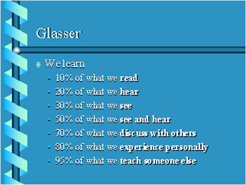
Figure 5. Slide presented at the 1999 AECT conference. Source: Retention Data Timeline
- William Glasser, psychiatrist and best-selling author of Reality Therapy (1965) and Schools Without Failure (1969). Glasser has "no demonstrable connection with the retention chart," nor does its content lie within Glasser's area of expertise (Subramony et al., 2014a, p. 15).
- Robert Glaser, educational psychology researcher—whose surname may have just gotten confused with Glasser's. Although Glaser did write extensively about the psychological principles underlying educational technology, like Glasser, he "did not invent or comment upon the fallacious retention chart" (Subramony et al., 2014a, p. 15).
- British Audio-Visual Society, extremely secret society? Across the pond and down under, a favourite mate of the retention data is a reference to the British Audio-Visual Society. Humourous indeed, because no such organisation exists: "there is no British Audio-Visual Society, nor has there ever been one" (Genovese, 2004; Subramony et al., 2014a, p. 15).
The final member of this regrettable roster of reckless references also never laid a hand on any such percentages, yet is hands down the most widely misattributed...
Fact #5. Edgar Dale is not the father of the "cone of learning", "learning pyramid", or any variation of the retention data.
As a renowned authority on the use of media in instruction, and a celebrated professor of education at the Ohio State University, Edgar Dale (1900-1985) published a lot during his career—and none of his writings ever dealt with percentages of remembering from reading, hearing, seeing, and so on.
In a classic 1946 textbook on Audio-Visual Methods in Teaching (later revised in 1954 and 1969), Dale introduced a model called the Cone of Experience, which classifies educational media and methods along a continuum from the most concrete experiences (at the base of the cone) to the most abstract (at the top):
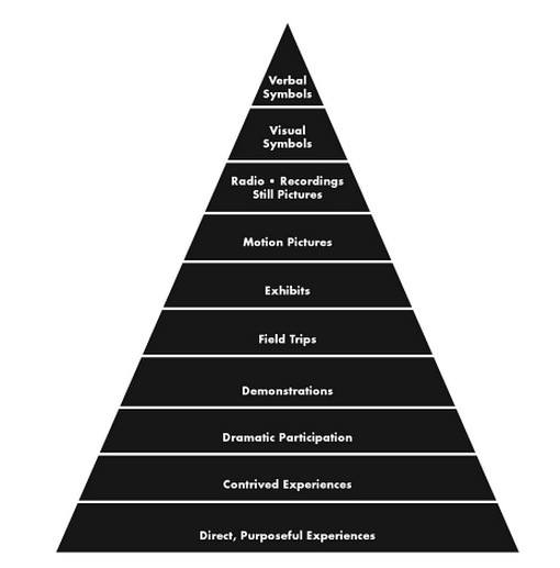
Figure 6. Dale's original Cone of Experience in Audio-Visual Methods in Teaching (1946). Source: Dale's Cone of Experience Timeline
Notice that the model contains (1) no numbers whatsoever and (2) no claims about "remembering." Furthermore:
- Nowhere in the three editions of Audio-Visual Methods in Teaching does Dale use the word "retention" to describe the outcome of a particular learning experience, nor does he present any numbers referring to empirical research (Lalley & Miller, 2007, p. 69).
- Nowhere in any of Dale's works does he mention or allude to percentages related to retention of material presented in various media formats. Dale was an expert in statistical analysis and thus "always cautious about limiting any statistical claims with painstaking care" (Subramony et al., 2014c, p. 23).
Dale's erroneous association with the spurious data came about circa 1970, when an unidentified person or persons superimposed retention figures onto the Cone. After years of tireless investigation, scholarly mythbusters Subramony, Molenda, Betrus, and Thalheimer (2014a) aren't clear whether we'll ever know who first fabricated this "corrupted cone" (p. 15):
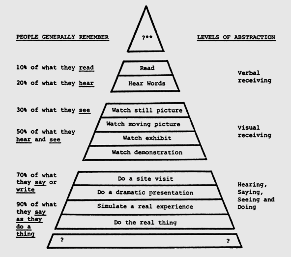
Figure 7. Retention data with Dale's Cone interpretation in a 1977 train-the-trainer manual (Bauman, 1977). Source: Corrupted Cone Timeline
Relying heavily of the efforts of these four dedicated researchers, I tried to structure this (not so little) look-what-I-found-on-Google report around "facts" that readers can verify in academic archives and library books—versus a superficial slice of cuz-the-internet-says-so, written merely to appease my own confirmation bias (vis-à-vis numbers that always smelled fishy to me).
The Cone Uncorrupted
To help clear any lingering cone-fusion, I'll end today's story by summarizing the ten levels of the authentic Cone of Experience (with a few modernizing touches, but minimal deviation from Dale's own words). Note that the headings below correspond to the original 1946 model (Figure 6), but I added terminology/technology that learning practitioners use today (in parentheses).
And in the spirit of providing more fruitful experiences, I tossed in a few exercises pertaining to an apple.
10. Verbal Symbols (Text)
Absolute abstraction. We can't get much further away from reality than reading about it on paper or screen. Verbal symbols bear no resemblance to the objects or ideas they stand for. Nevertheless, they readily convey an endless range of subject matter terminology, concepts, principles, formulas, and other knowledge. (Dale, 1946, p. 46-47)
Practice:
Read this word: jablko
Fun word, huh? It means apple in Slovak, my mother tongue.
The letters J-A-B-L-K-O and A-P-P-L-E don't look, sound, smell, taste, or feel anything like actual fruit. What they do share is a common meaning that native Slovak/English speakers learn at a very young age.
9. Visual Symbols: Charts, Graphs, Maps, Etc. (+ Diagrams, Infographics)
Graphic substitutes for literal reality. If everyone could examine numbers like Ben Affleck in The Accountant, charts and graphs would serve little purpose. To recognize patterns and relationships in numeric data, most of our brains prefer the visual interpretability of bars, lines, and scatterplots.
Of course, visual symbolism isn't just for numbers. Flowcharts convert stages of operation into basic shapes and arrows—org charts do the same for what people do and who they report to.
Diagrams and schematics reduce the assembly, operation, and repair of concrete objects into simple illustrations free of unnecessary detail. Parts of the earth? Maps. Events from the past? Timelines. Just about any reality we need to explain clearly can be easier to understand with visual symbolism. (p. 45-46)
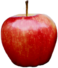
8. Still Pictures, Radio, Recordings (Photos, Podcasts, Audio)
A feast for the eyes or ears. Level 3 represents unisensory media that we can experience in no fixed order—photographs and audio recordings. Notice that unlike common misrepresentations of the Cone of Experience, which treat "seeing" as more effective than "hearing," Dale placed still pictures (visual media) on the same level of abstraction as radio and recordings (auditory media).
Practice:
Click this stock photo of a jablko to open its Wiktionary page. Then play the audio clip of its pronunciation.
Source: Microsoft Office
Did combining textual, visual, and auditory inputs strengthen the connection between abstraction and meaning? If not, repetition, repetition, repetition!
7. Motion Pictures (Videos, Animations)
A moving feast for the eyes and ears. Unfolding with a compression of time and space, videos present on-screen abstractions of real-life processes and events.
Although streaming experiences can't recreate the richness of reality, and they deliver that reality in a deliberate and contrived order, this loss of directness has certain compensating advantages. Not only do learning videos edit out the irrelevant stuff from the live edition of the show, they can add zoom and slow motion to parts we should concentrate on, which we can rewind and replay as many times as it takes. (p. 44)
Practice:
Click here to watch an indie microdocumentary (okay, 13-second iPhone video) featuring a jablko.
6. Exhibits
Meaningful displays with limited handling. Levels 6 through 4 open the door for—but don't necessarily let in—an expanded range of sensory and participatory experiences. While some exhibits are specifically designed for interactivity, others restrict learners to look but don't touch. (p. 43)
5. Field Trips
Sights and sounds of real-world settings. Aside from the occasional opportunity to hop in a fire truck or milk a cow, the main activity for field trippers is observing from the sidelines. (p. 42-43)
4. Demonstrations
This is how it works and/or how you do it. Like exhibits and field trips, demonstrations may or may not include an element of participation. In some learning situations, seeing how it's done isn't much good if we can't try it for ourselves. In others, either the demonstration alone gives us what we need to know, or hands-on activity is logistically unfeasible. (p. 42)
3. Dramatic Participation (Roleplay Exercises)
Reconstructing situations for instructional purposes. Level 3 marks the point where learners—at least some of them—must shift from observers to participants. Dramatization of real-life experiences can help eliminate elements that mean little and distract attention, while sharpening and emphasizing those that really "matter" (p. 41).
Practice:
Either individually or with a partner, roleplay the following scenario in which a non-Slovak speaker desperately needs a specific piece of fruit:
Your Slovak friend has abandoned you at his parents' new country cottage, where you have just awoken from an extended, absinthe-and-jetlag-induced slumber. You would kill to bite into a crisp juicy apple.
You wander into the kitchen only to discover that the brand-new residence has yet to be stocked with anything edible. While wobbling back to your cave, you plow torso-first into your Slovak friend's mother. Of course, she speaks not a word of English.
After an agonizing exchange of gibberish and hand gestures, you figure out that she is going to the market and asking if you have any requests. Luckily enough, the one thing your craving is the only word you know in Slovak...
On a sheet of paper, write the word apple in Slovak. Then hold it up and show it to your friend's mother as you enunciate the word and slowly nod.
2. Contrived Experiences (Simulations, Some Gamification)
"Editing" of reality that make it easier to grasp. Some realities are far too much to take in all at once. Their sprawling acreage or mechanical functions would be complicated and baffling to a first-time first-hander. That's why mock-ups, working models, and simulations differ from the original in size or complexity.
Whether they cut the colossal down to comprehensible size, carve out a cross-section from a concealed interior, or control distractions competing for cognitive load, contrived experiences are imitations that teach better than the realities they imitate. (p. 40)
1. Direct Purposeful Experiences (Hands-On Practice)
Concrete reality. At the base of Dale's Cone of Experience, we learn through first-hand participation with responsibility for the outcome:
It is the rich, full-bodied experience that is the bed-rock [sic] of all education. It is the purposeful experience that is seen, handled, tasted, felt, touched, smelled. It is the unabridged version of life itself—tangible experience, which we commonly refer to as "something you can get your fingers on," "something you can sink your teeth into," etc. (p. 38)
Practice:
State the Slovak word for apple. Then go grab the nearest apple and repeat the word as you touch, smell, and taste the apple. (Mentally repeat it while you chew the apple.)
References:
- Betrus, A. (2016, May 19). The corruption of Dale's Cone of Experience.
- Dale, E. (1946, 1954, 1969). Audio-visual methods in teaching. New York: Dryden Press.
- Genovese, J. E. C. (2004). The ten percent solution: Anatomy of an education myth. Skeptic, 10(4), 55-57.
- Januszewski, A., & Betrus, A. (2002, November 18). For the record: The misinterpretation of Edgar Dale's Cone of Experience. Dallas, TX: Annual convention of the Association for Educational Communications and Technology (AECT).
- Lalley, J. P. & Miller, R. H. (2007). The learning pyramid: Does it point teachers in the right direction? Education, 128(1), 64-79.
- Molenda, M. (2003). Cone of Experience. Draft for publication in A. Kovalchick & K. Dawson, K. (Eds.). Educational Technology: An Encyclopedia. Santa Barbara, CA: ABC-Clio.
- Molenda, M. (2004). Reader Comment: On the Origins of the “Retention Chart” An addendum to Subraony. Educational Technology, 44(1), 64.
- Subramony, D., Molenda, M., Betrus, A., & Thalheimer, W. (2014a). The mythical retention chart and the corruption of Dale’s Cone of Experience. Educational Technology, 54(6), 6-16.
- Subramony, D., Molenda, M., Betrus, A., & Thalheimer, W. (2014b). Previous attempts to debunk the mythical retention chart and corrupted Dale's Cone. Educational Technology, 54(6), 17-21.
- Subramony, D., Molenda, M., Betrus, A., & Thalheimer, W. (2014c). The good, the bad, and the ugly: A bibliographic essay on the corrupted cone. Educational Technology, 54(6), 22-31.
- Subramony, D., Molenda, M., Betrus, A., & Thalheimer, W. (2014d). Timeline of the mythical retention chart and corrupted Dale’s Cone. Educational Technology, 54(6), 31-34.
- Thalheimer, W. (2006, May 1). People remember 10%, 20%... Oh really? [Blog post]. (Originally posted 2002)
- Thalheimer, W. (2015a, January 5). Mythical retention data & the corrupted cone [Blog post].
- Thalheimer, W. (2015b, March 12). Debunk this: People remember 10 percent of what they read [Blog post].