3 Ways To Improve Your Content Experience With Typography
Trying to get engagement in your eLearning courses is a difficult task at the best of times. Those engaging with your content have developed more sophisticated attitudes towards what makes for a good Learning Experience. The proliferation of high quality content sites across the web, and the increasing ease of access to free or almost free content editing and publishing tools, means that it's not enough to simply create an eLearning course and assume that it will be well received.
We need to be aware of the overall content experience that we present. An important aspect of the overall experience is the Typography that we use.
Usability.gov, a leading resource for user experience (UX) best practices and guidelines within the US government and private sectors, defines typography as referring:
To which fonts are chosen, their size, alignment, color, and spacing.
Wikipedia defines it as:
The art and technique of arranging type to make written language legible, readable, and appealing when displayed.
This article looks at just 3 of the fundamental typographic factors you should consider when creating your eLearning Content.
- The text used for this article came from the Marco Polo page on Wikipedia.
- MS Word was used to illustrate the typographic changes made.
- The Content Editor hosted within the TopClass LMS from WBT Systems was used to create the resulting eLearning content.
N.B. Any eLearning Content Editor supporting the content formatting detailed in this article can be used. - Based on the article 3 Typography Tips For A More Comfortable Read by Luke Jones.
We'll start with simple unformatted text pasted into a MS Word document to highlight the impact that applying our typographical factors has.
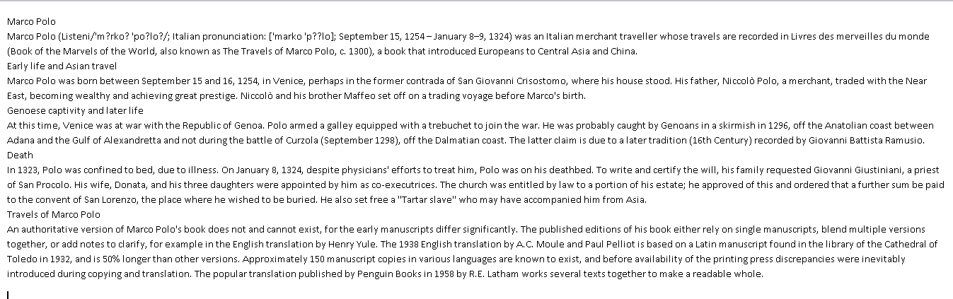
Figure 1. Unformatted Text In MS Word
1. Use A Typographic Hierarchy To Structure Your Page.
The typographic hierarchy is the system for organizing type that establishes an order of importance within the data, allowing the reader to easily find what they are looking for, and navigate the content. It helps guide the reader’s eye to where a section begins and ends, whilst enabling the user to isolate certain information based on the consistent use of style throughout a body of text.
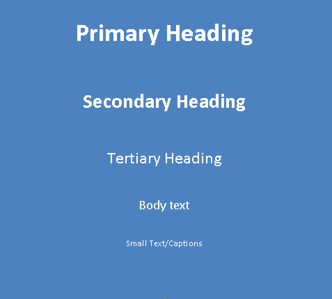
Figure 2. Typographic Hierarchy
All font sizes should be derived from the body text. The following steps can be used to define your typographic hierarchy:
- Body text.
Text should be comfortable to read. For this example, it is set to 14px. - Primary heading.
180–200% of the body text, so between 25–28px. - Secondary heading.
130–150% of the body text, between 18–21px.

Figure 3. Text With Typographic Hierarchy Applied
Other typographic hierarchical elements may be required; some further examples are as follows:
- Tertiary heading.
100–125% of the body text, so between 14–17px. - Small text/Captions.
70–75% of the body text, so between 10–11px.
2. Use Vertical Spacing To Make Your Words Easier To Scan.
We need to ensure that the line spacing and space between paragraphs allows the eye and brain to more easily decipher characters, words, and word shapes.
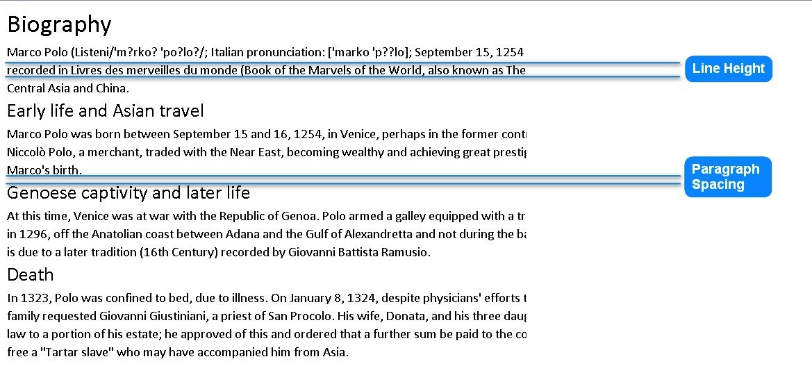
Figure 4. Vertical Spacing
Paragraph spacing should be set equal to the Body Text size, in this case 14px.
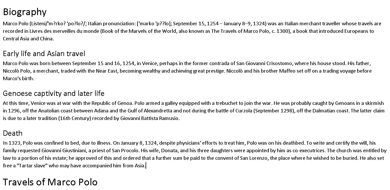
Figure 5. Text with Paragraph Spacing Applied
Line spacing should be set to somewhere between 120–160% of the text size. Smaller body text requires increased line spacing in order to give each word room to breathe. It should be possible to fit a sideways ‘h’ between lines without it hitting the tops of d/b/t’s (ascenders) or the bottoms of p/q/y’s (descenders). In this case, the line-height used should be between 17–22px.
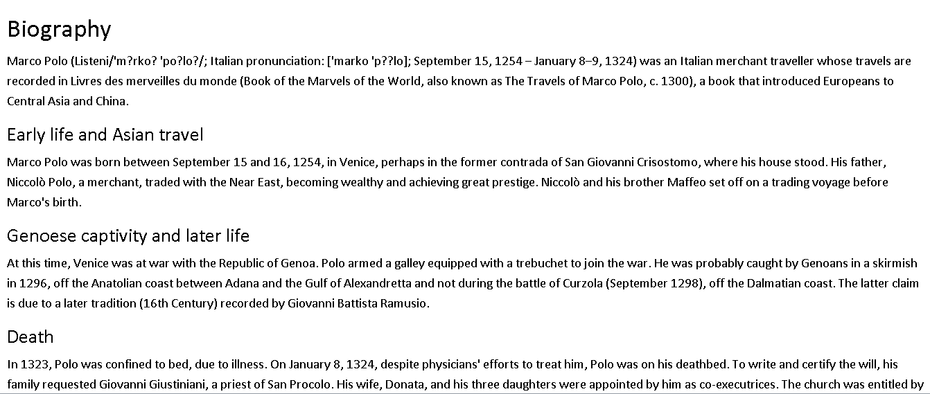
Figure 6. Text With Line Spacing Applied
3. Adjust Line Lengths To Increase Readability.
Long lines of text are difficult to read. The ideal number of characters per line is 65–75. This length of a line of text is referred to as the measure. The measure is defined by the width of the body text rather than those of headings or sub-headings.
A line encompassing upper -and lower-case letters and numbers is 62 characters, an easy way of finding a comfortable measure, i.e. abcdefghijklmnopqrstuvwxyz ABCDEFGHIJKLMNOPQRSTUVWXYZ 1234567890.
Reduce the width of the column of text until it meets this 65–75 character limit.
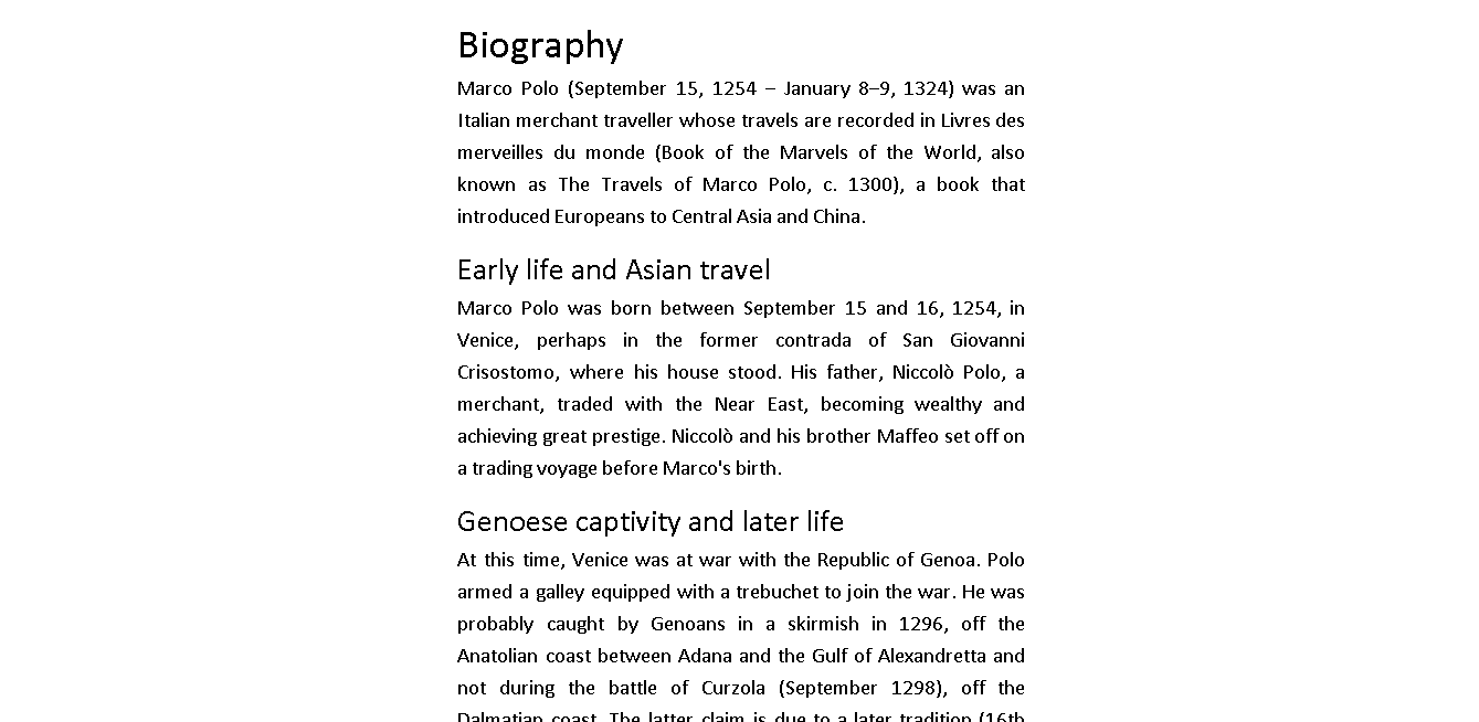
Figure 7. Text With Line Length Measure Applied
Summary Of Typography Techniques Applied
The animated gif below shows these changes being applied sequentially (may need to click to play in supported browsers):
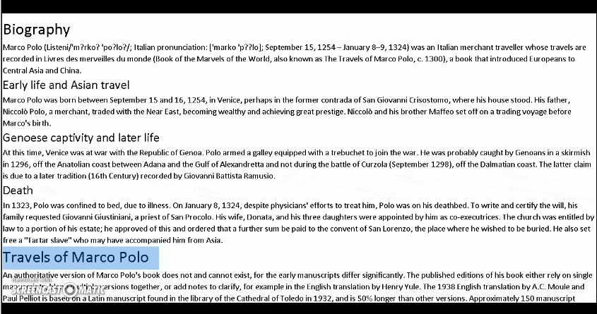
Figure 8. Typographic Techniques Applied In Sequence
All of the typographic principles detailed above are applied to the eLearning content shown below created using the Content Editor within the TopClass LMS. This particular content experience displays the content via a smartphone.
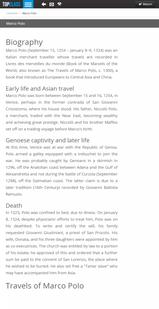
Figure 9. Presentation Of eLearning Content
In this article, I have attempted to show how you can improve your content experience with typography. It addressed only a small subset of the myriad of typographical features worth considering. The three discussed provide very quick and easy ways to dramatically improve the overall content experience, i.e.
- Typographical hierarchy,
- Vertical spacing, and
- Line measure.