


What Are PowerPoint Tricks? (And Why Professionals Use Them Strategically)
PowerPoint tricks are techniques, shortcuts, and presentation strategies professionals use to create clearer, faster, and more engaging presentations. In corporate learning and business communication, these tricks go beyond simple slide editing. They help Instructional Designers, teachers, and L&D professionals improve how information is delivered and understood.
Basic PowerPoint usage usually focuses on adding text, images, and transitions. Strategic use, however, involves advanced design thinking. Modern Microsoft PowerPoint features also make it easier to build visually consistent and interactive presentations at scale. Professionals use PowerPoint hacks, PowerPoint slide tips, and storytelling techniques to guide attention, simplify complex ideas, and support learning outcomes.
These strategies often fall into four categories:
- Design tricks for cleaner and more professional layouts.
- Animation tricks that reveal information step by step.
- Structural storytelling tricks that improve presentation flow.
- Efficiency hacks that speed up content creation and editing.
For Learning and Development teams, these PowerPoint presentation tips and tricks directly affect training effectiveness, learner engagement, and stakeholder communication. This is because well-designed presentations help audiences retain information, follow ideas more easily, and stay focused during workshops, onboarding sessions, or business presentations. That is why many professionals now treat PowerPoint as a strategic communication and Instructional Design tool rather than just presentation software.
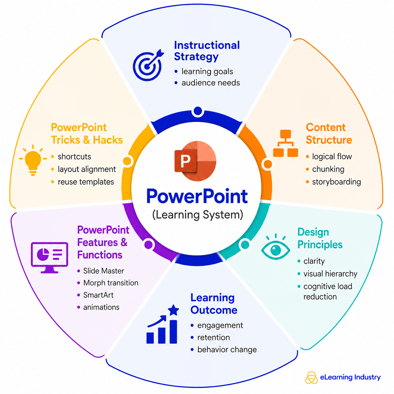
Core Microsoft PowerPoint Features Professionals Actually Use
Many professionals already know the basics of PowerPoint. What separates effective presentations from forgettable ones, though, is how specific Microsoft PowerPoint features are used to improve communication, learning, and audience engagement.
SmartArt
Instructional Designers and trainers use SmartArt to simplify complex ideas into visual processes, timelines, and frameworks. Instead of overwhelming learners with text, SmartArt helps organize information in a way that is easier to understand and retain.
Morph Transition
Unlike traditional animations, Morph creates smoother movement between slides, making presentations feel more connected and easier to follow. This is especially useful in training sessions where presenters need to guide attention step by step.
Slide Master
The Slide Master is another essential tool for teams creating large volumes of content. It ensures consistency across slides, which is critical for maintaining professionalism and reducing production time. For L&D professionals managing multiple training decks, this feature supports scalability and brand alignment.
Icons And Vectors
Professionals also rely heavily on icons and vector graphics to create cleaner, more engaging visuals. Visual communication matters because audiences process images faster than text-heavy slides. These PowerPoint presentation tips help presenters make information more accessible without overloading learners.
Presenter Coach
For delivery and preparation, Presenter Coach and rehearsal tools provide real-time feedback on pacing, filler words, and presentation flow. These Microsoft PowerPoint tips are particularly useful for trainers, facilitators, and business leaders preparing for high-stakes presentations.
Cloud-Based Collaboration Features
Finally, cloud-based collaboration features allow teams to co-edit presentations in real time. Combined with templates and AI-powered design suggestions, these PowerPoint hacks help organizations create polished presentations faster while improving consistency across departments.
Essential PowerPoint Tricks That Save Time And Improve Quality
For Instructional Designers, teachers, and L&D professionals, creating presentations at scale is not just about design quality. It is also about efficiency. The best PowerPoint tricks help teams build polished learning materials faster without sacrificing consistency or learner engagement.
Keyboard Shortcuts
One of the simplest but most effective PowerPoint hacks is learning keyboard shortcuts. Commands for duplicating objects, grouping elements, or quickly switching between slides can significantly reduce editing time during large training projects. These small workflow improvements become especially valuable when managing dozens of presentation decks.
Alignment And Distribution
Another important practice is using alignment and distribution tools. Clean spacing and properly aligned visuals make presentations look more professional and easier to follow. This is one of the most overlooked PPT tips, especially in corporate learning environments where visual clarity directly affects comprehension.
Formal Painter
The Format Painter is another feature that saves time while improving consistency. Instead of manually adjusting fonts, colors, or shapes on every slide, teams can instantly copy formatting across multiple elements. This helps maintain a unified visual identity across onboarding decks, workshops, and eLearning materials.
Duplicating Slides
For large-scale content production, duplicating and reusing slides efficiently is essential. Many Instructional Designers create modular slide libraries with reusable templates, diagrams, and layouts. This approach speeds up development while supporting design consistency across training programs.
Bulk Editing With Slide Master
Slide Master is also one of the most valuable PowerPoint hacks for bulk editing. It allows teams to update branding, fonts, logos, and layouts across an entire presentation from a single location. This is particularly useful for organizations managing multiple learning assets.
Compressing Visuals
Finally, compressing images and videos helps optimize presentation performance. Large media files can slow down delivery during live sessions or virtual training. Performance optimization ensures smoother experiences for both presenters and learners.
PowerPoint Presentation Tricks For Better Learning Design
Strong learning presentations are not built around flashy slides. They are built around clarity, structure, and learner understanding. That is why effective PowerPoint tricks focus less on decoration and more on helping audiences absorb and retain information.
One Idea Per Slide
One of the most important PowerPoint presentation tips and tricks is the "one idea per slide" principle. When a slide tries to explain too many concepts at once, learners become overwhelmed and retention drops. Separating ideas into smaller visual sections helps Instructional Designers guide attention more effectively.
Reducing Cognitive Load
Reducing cognitive load is equally important. Instead of long paragraphs, use concise text, visuals, icons, or diagrams to simplify information. This is one of the most effective tips for PowerPoint presentations because it makes content easier to process during live sessions, workshops, and online training.
Visual Hierarchy
Visual hierarchy also improves learning flow. Larger headings, consistent spacing, and clear alignment help audiences understand what matters most on each slide. Good contrast between text and background is another essential design principle. If learners struggle to read the content, engagement declines quickly.
Story-Driven Sequency
Many professionals also make the mistake of relying on bullet-heavy slides. A stronger approach is story-driven sequencing. Rather than listing information, structure slides around a problem, insight, or outcome. This creates momentum and keeps learners engaged throughout the presentation.
Aligning Design With Learning Goals
The best tips for good PowerPoint presentations also align slide design with learning outcomes. Every visual, animation, or transition should support understanding, not distract from it. In professional learning environments, effective presentations are designed for retention and application, not decoration.
How To Make A Cool PowerPoint That Actually Engages Audiences
Knowing how to make a cool PowerPoint is less about flashy effects and more about how clearly your message is understood. In professional environments, a cool PowerPoint presentation is one that feels effortless to follow, not overloaded or distracting.
Structure Your Narrative
A strong starting point is narrative structure. Think in terms of problem → insight → resolution. First, define the problem your audience cares about. Then introduce the insight or key idea that reframes it. Finally, close with a resolution or action. This structure helps turn even simple slides into meaningful stories, which is especially important for Instructional Designers and L&D professionals who need to hold attention and improve learning retention.
Prefer Visuals Over Text
Next, prioritize visuals over text dominance. One of the most effective cool PowerPoint ideas is to let images, diagrams, and icons do the heavy lifting instead of long paragraphs. When slides are visually driven, audiences focus on the speaker instead of reading ahead.
Keep Slides Consistent
Consistency also matters. Apply a clear theme and brand system across all slides, including fonts, colors, spacing, and layout. This avoids making the presentation repetitive and uninspiring. When people search for how to make cool PowerPoints, this consistency is often what separates average decks from professional ones.
Add Real-World Examples
To make content more relatable, integrate real-world examples or scenarios. Instead of abstract ideas, show how concepts apply in actual work situations, training programs, or business challenges. This makes your message easier to remember and apply.
Use Visual Metaphors
You can also use visual metaphors to simplify complex ideas. For example, a journey path can represent learning progression, or building blocks can represent skill development. These cool PowerPoint presentation techniques help translate abstract thinking into something concrete.
PowerPoint Uses In Learning, Training, And Business Strategy
When we talk about uses for PowerPoint, we are really talking about how teams use it to build clarity, alignment, and engagement across different business functions.
Uses In Corporate Training
In corporate training, PowerPoint is widely used to develop training modules that guide learners step by step through key concepts. Instructional Designers often use it to structure content into logical sequences, making complex information easier to understand and retain. It also supports the creation of Instructional Design frameworks, where learning objectives, activities, and assessments are visually mapped out in a simple and consistent way.
Uses In Business
In business strategy, PowerPoint use extends into sales enablement presentations, where teams communicate product value, customer insights, and competitive positioning. These decks help sales professionals deliver consistent messaging and improve conversion effectiveness. Similarly, leadership communication decks are used by executives to share strategy, vision, and performance updates in a structured and visual format that stakeholders can quickly understand.
Uses In Employee Development
Another important area is employee development. PowerPoint supports onboarding journeys, helping new hires understand company culture, processes, and expectations through clear, visual storytelling. Instead of long documents, organizations can create guided onboarding experiences that feel more interactive and digestible.
Uses In Continuous Learning
For continuous learning, PowerPoint is also used to design microlearning visual frameworks. These are short, focused learning units that deliver one concept at a time. This approach aligns well with modern attention spans and helps reinforce learning over time.
Best Practices Checklist: PowerPoint Tricks For Professionals
When creating effective presentations, following a simple checklist can make a big difference in quality and clarity. These best PowerPoint tips help Instructional Designers, teachers, and L&D professionals turn complex information into clear, engaging slides that support learning outcomes.
- One message per slide. This keeps your audience focused and prevents information overload.
- Use visuals intentionally. Don't add images just for decoration. Every visual should support understanding or reinforce a key idea.
- Consistency. Keep your design, fonts, and colors uniform throughout the presentation to build trust and improve readability.
- Limit animations. While a subtle PowerPoint trick like a fade or simple transition can improve flow, too many effects can distract from the message.
- Prioritize storytelling. Instead of building slides as isolated points, think in terms of a narrative that guides your audience from problem to insight.
- Test readability across devices. What looks clear on a large screen may not work on a laptop or mobile view.
Conclusion
PowerPoint is no longer just a presentation tool; when used well, it has become a strategic communication system. For L&D professionals, Instructional Designers, and trainers, the real value of PowerPoint tricks lies in combining strong visual design with clear instructional strategy. When slides are built with purpose, they support learning instead of overwhelming it. So, focus on using these PowerPoint tricks to create clarity, structure, and meaningful engagement that helps audiences learn and remember better.