Graphic Design Best Practices eLearning Professionals Should Know
While the text may often steal the show in eLearning courses, the graphic design is actually what properly showcases your written content. Without the right typography, images, color scheme, and layout, even the most articulate eLearning materials would be chaotic and confusing for your learners. By following these graphic design best practices for eLearning professionals you can design eLearning courses that are powerful, meaningful, and visually stunning.
- Tap into the power of typography.
The fonts you use should emphasize the text and highlight the most important ideas and concepts. Using creative fonts can bring the subject matter to life and increase learner comprehension, but only if it is clearly legible and used in moderation. Here are 3 important typography tips to keep in mind when creating your next eLearning course: First, don’t use more than two font types. Including a wide range of fonts will only clutter the page, rather than add to its visual appeal. Second, depending on the font you’re using, keep the size between 14 to 16 pixels for the body of the text. For headers and sub-headers you can use slightly larger font to grab learners’ attention. Last, but not least, use font types that are easy to read on both computers and mobile devices. For example, an Arial font is more mobile-friendly than a more elegant font that may not be as legible on a smaller screen. - Use color with caution.
Color has the rare ability to evoke certain emotions and make the reader feel more connected to the subject matter. This is why it’s essential to use color with caution in order to achieve the desired effect. For instance, if you want to relax your learners before an important exam you would opt for blue instead of red to calm their nerves. Here are a few more eLearning color points you’ll want to consider: Stick with a color scheme that involves 2 to 3 colors, any more than that and your design can start to look chaotic. This ultimately distracts your learners from the overall value of the eLearning course. In addition, if you are using colored fonts, try to stick with the same shade for the body text all throughout your eLearning course. Likewise, choose one color for the headers and another for the sub-headers to help them standout. Last, opt for colors that contrast. For example, you can use a more subdued color, like soft yellow, and pair it with a dark blue to add depth to your eLearning course design. - Effective online learning begins with a successful layout.
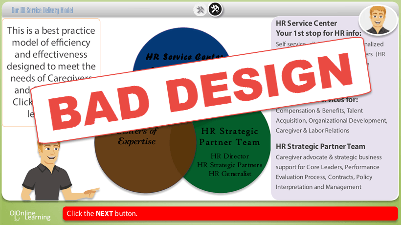
Though the layout may not be one of the design elements that immediately stands out for your learners, it does have a direct impact upon knowledge comprehension and retention. Utilizing a UI design software will allow you to structure your pages intuitively. Keep in mind that the learner’s eye is naturally going to scan the page from top to bottom and left to right. As such, you should place the most important information, such as the key takeaways near the top and the right-hand side of the screen. Another tip is to place similar objects or concepts next to one another to emphasize their connection. You can also use a different color to highlight each group. Finally, an important piece of information should never be hidden on the page, such as inside a clickable link or in the middle of an image. You should also draw the learner’s eye to the key concepts or ideas by making them the focal point of the page. - Opt for cohesiveness over clutter when choosing visuals.
Visuals, such as image, icons, and graphics, boost learners’ engagement and make the eLearning course more dynamic and exciting. They can also help to illustrate the most important subject matter. When integrating visuals into your graphic design, you should always use high quality, royalty free images. The learner should immediately be able to tell what it is instead of trying to decipher a blurry graphic. In addition, the images you choose should always relate to the subject matter. If they are only there for their aesthetic value and don’t serve the learning goals and objectives, then it’s best to just omit them entirely. Finally, don’t forget to avoid graphics that contain text or culture-specific images if you are planning on localizing your eLearning course in the future. - Leave White Space.
Not every square inch of the page needs to be filled with graphics, text, and buttons. In fact, leaving some white space can actually prevent cognitive overload and improve the visual appeal of your eLearning course. When you leave blank space around the text and graphic elements on the page, your learner’s eye will automatically drift to the information they need to retain. Think of the white space as a frame that draws their attention to the key pieces of knowledge they need to absorb. - Know your audience.
Every element should cater to the needs of your learners. Before you even begin mapping out your eLearning course design, you should have a keen understanding of who you are designing the eLearning course for. Every image, block of text, and color you choose for your eLearning course must offer some benefit for your audience. It must serve their learning needs and help them acquire the information they need, or else it doesn’t hold a place in your design layout.Gain the attention of your Learners with the most visually appealing content!Find, choose and compare the top eLearning Content Development Companies for Graphic Design!
Graphic design is essential to the overall effectiveness of your eLearning course. Even elements that don’t immediately grab the attention of your audience work behind the scenes to create a more cohesive look. So, keep these graphic design best practices on hand when designing your deliverable to develop the most beneficial learning environment for your learners.
If you’d like additional graphic design tips for your next online course, the article Top 10 Graphic Design Tips for eLearning Success features 10 top tips you can use to achieve eLearning success.