
What To Expect From A Responsive Design eLearning Authoring Tool
Many authoring tools claim to be responsive but what exactly are they referring to? In this article, we outline some of the main features of being responsive to give you an idea of what to expect from a responsive design eLearning authoring tool.
Get a free eBook on how to create and distribute a Responsive eLearning Course
1. Most Importantly, A Responsive Design eLearning Authoring Tool Is Genuinely Responsive!
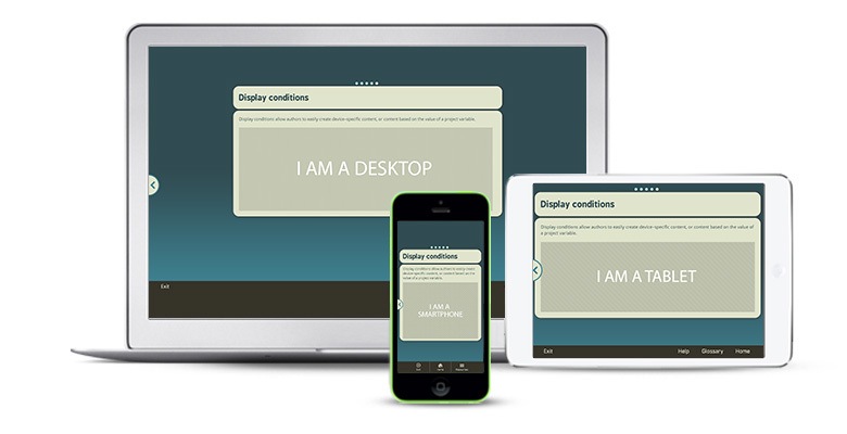
The most vital factor in a responsive authoring tool is that you are able to create truly responsive content. This might seem obvious, but responsiveness is what enables authored content to work on multiple devices – whether that’s an iPhone or Android smartphone, a tablet, laptop, or desktop device. Responsive design is supported ‘behind the scenes’ by HTML5, a mark-up language code used when designing web pages. More on this below...
Smartphones, tablets, laptops, desktop computers – they all have the ability to display eLearning content flawlessly... as long as the content is truly responsive! Responsive courses will automatically detect the screen size and layout of a device, and respond by fitting the content into the maximum space that the device’s screen size allows. This means that you don’t have to think about creating lots of different versions of the same course for use on different devices, as responsiveness will take care of the hard work for you. Equally, there’s no need to worry that the course you’ve created won’t function as well on a mobile device as it does on the laptop or desktop computer used to create it.
Responsive authoring tools help to make your learning flexible because you’re not just limiting employees to take their training only on a computer in the workplace. With a course built using responsive design, employees have the choice or whether to use their own personal devices to complete training on the move and can opt to use their downtime to do so. Ensuring that learning looks consistent on multiple devices will allow for the same learning experience for all employees, no matter what device they’re choosing to learn on. This essentially frees up time-starved employees to complete engaging eLearning courses when they want to, on the device they want. That could mean accessing mobile learning (or mLearning) content while commuting to or from work, or sitting at their computer during a break. Thanks to responsive design eLearning authoring tools, the power to choose when to learn is in the learner’s hands.
2. Responsive Design Is Supported By HTML5
Responsive design is made possible because of HTML5, also known as Hypertext Markup Language, the current standard of website code used for producing pages and consuming content on the Internet. HTML5 is essentially responsible for the way a page runs and allows elements like audio, video and navigation to work smoothly without requiring extra plugins to do so. Most modern browsers now support HTML5 and the majority of us rely on it every time we use the web. But learning designers don’t need to worry about having to work with complicated HTML5 code to create flexible multi-device eLearning content, as a truly responsive authoring tool should already be HTML5-compliant. With the right eLearning authoring tool, there’s no need to get bogged down with worry over whether the eLearning course content supports HTML5 – the authoring tool does it all for you!
3. Responsive Design Has A Customizable Course Layout
Making your content responsive is great, but an authoring tool wouldn’t be an authoring tool if it didn’t allow for some eLearning content customization. Learning designers will benefit from an authoring tool that lets them build their own course layout to really take advantage of the multi-device possibilities. Column layout can work well with responsive design, and anything from two to four columns is usually a good format to aim for. You should also be able to adjust the widths of the columns so that you can customize your course to display the different components in the most effective way. If you’d rather take a simpler approach to course layout, then a responsive authoring tool that has ready-made templates and themes is a great idea, as it simply requires you to enter the content into the pre-designed layout.
4. Responsive Design Helps Users Choose Navigation Styles

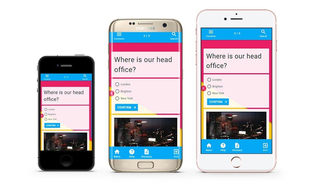
By using a responsive HTML5-ready authoring tool, you can take advantage of using different navigation methods. There are generally two styles to pick from:
- Continuous scroll displays content vertically, and loads more as the user navigates down the web page with either their mouse or touch-screen.
- Alternatively, courses can run in a horizontal slide-based format and use click-to-continue navigation.
A responsive authoring tool should give you the option to choose the navigation that best suits your learners, or even to use a combination of both if necessary.
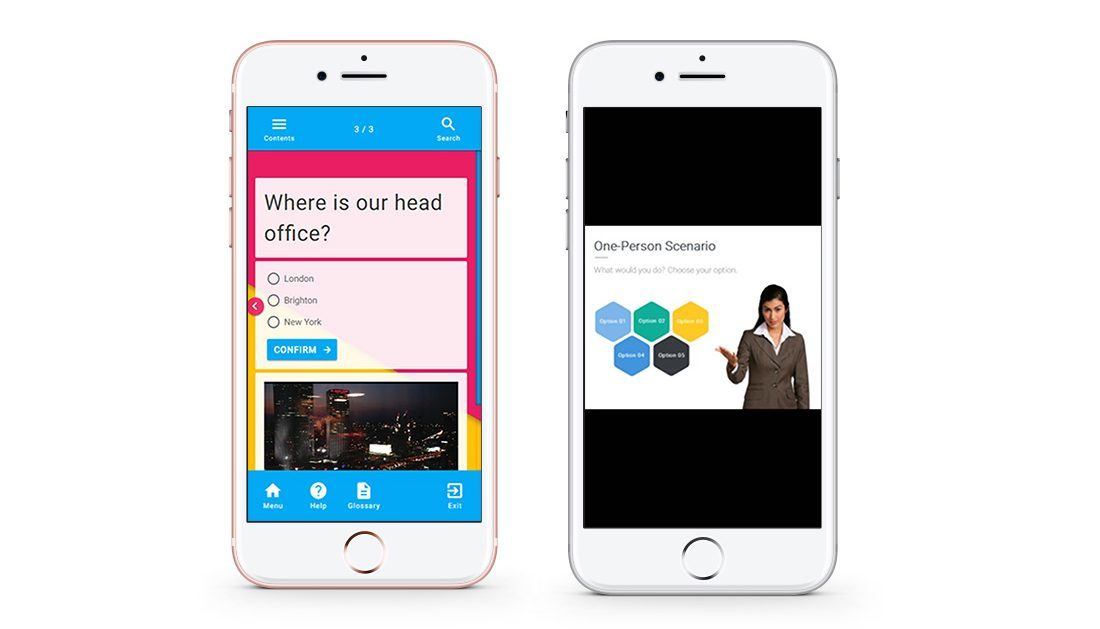
Responsive authoring tools produce even more effective eLearning if they allow you to set controls for how much a learner can view before moving further in their training. This might involve presenting the learner with a question about a previous module, or prompting them to press an interactive button to receive further information, for example, before moving on. These types of controls help to make sure that learners are actively engaging with the eLearning content and stops learners from speeding through courses without actually taking anything in.
5. Responsive Design Allows You To Preview A Course Before Sending It Live
A good responsive authoring tool will allow you to preview your courses on various devices to get an idea of what it will look like with different screen sizes and orientations – before sending it out live to learners. There are often different options to distribute an eLearning courses, ranging from a direct web link shared privately or across social media, to a QR code that can be scanned into a mobile device for colleagues to review. Collaboration is essential for producing effective eLearning, so it’s important to be able to get feedback from colleagues about what’s successful and where there’s room for improvement. This feedback can then be applied to improve the look of the course or the content within it, all from within the authoring tool course editor.
A collaborative eLearning authoring tool should be cloud-based to allow for quick and seamless online interactions. Cloud-based authoring tools mean no complicated or large file downloads – design teams, whether they’re based in different departments like Learning and Development, HR, and compliance, for example, or whether they sit in different geographical locations, can collaborate ‘in the cloud’. All that’s needed is the eLearning authoring tool and an Internet connection.
A Final Word On Responsive Design Authoring Tools
We’ve explored a handful of the features of a responsive design eLearning authoring tool, from the all-important responsiveness, customization, navigation options and course sharing, to preview possibilities. If you’re on the lookout for a responsive authoring tool, be sure to keep these essential eLearning authoring tool features top of mind to allow you to create the best possible eLearning content which is accessible on multiple devices.